
Project Type Client Project
Role UX Researcher, UX/UI Designer
Duration 2-week sprint
Platform Website
Tools Figma, Miro, Slack, Zoom, Google Suite, Whiteboard, Post-its, Pen, Paper
Client Overview
Lina is an AI powered time capsule that enables the sharing of love and life experiences, created by Generation Transfer. In creating the Lina app, Generation Transfer’s goal is to help parents establish meaningful, lasting and significant relationships with their children. They want to create a private online platform for families, where family bonds can be strengthened and parents can learn to be better parents.
The Ask
Generation Transfer currently has an MVP app, Lina, that will be released to the public shortly but they do not yet have a web based platform to support the app. They tasked our team with performing an audit of the app’s UX and UI, specifically in regards to their onboarding process, and translating the app experience onto a web platform.
Client Meeting
Our first step in this project was to meet with Danny Feltsman, Lina’s creator, founder and CEO. We came to him with some prepared questions in order to gain as much information as possible about Lina and get a grasp on what his expectations were for the project.
Danny told us about how when his son was born, he wanted to make a video speaking directly to him, telling him how excited he was to be his Dad. But he had no place to put this very special, personal video. Danny knew he didn’t want to share it on social media because it was really only meant for his son’s eyes, and he was too young to appreciate it yet. Where does one store something so precious without forgetting to share it in 5, 10 years time? This was the beginning of Danny’s journey toward creating Lina.
Competitive and Comparative Analysis
First, we dove into researching apps that are potential competitors to Lina. Generation Transfer was able to provide us with some examples which fit mainly into three categories: Time Capsule apps, Memory Sharing/Baby Tracking apps, and Journaling apps. Lina is able to offer features that span all of these areas so we did three separate C&C’s to analyze apps within each group and put them up against Lina to see where the opportunities for growth were.

While investigating the time capsule apps, we were surprised to see they typically were lacking in functionality. They did the bare minimum of creating posts to be seen only in the future but lacked features like a timeline, sharing and any kind of social features.

The memory sharing/baby tracking apps also were fairly sparse, offering features to allow a very basic experience. For most, you could upload photos and videos, and export those memories but not much other than that. Here we were able to glean some prospective features for Lina, for example a Milestones page where important firsts can be collected.

The journaling apps were by far the most robust group of apps we researched out of the three. These apps were full of essential features and of the three groups we investigated, were the only ones with accompanying web platforms. From these applications we drew a lot of fundamental features to be carried over into Lina’s website. Automatic metadata collection, alternative views of one’s posts (map or calendar) and post tagging were all features we felt would improve the experience of Lina users.
Interviews
Generation Transfer was able to provide our team with some User Segment Analyses of potential users of the Lina app.
There were 5 groupings:
Grandparents with Basic Computer Competence
Hands-on “High Investors” in their Children
Parents seeing their own parents starting to decline
Parents in high-risk jobs or with serious health issues
Business travelers and parents with shared custody
However, these groupings were not based on user research so we set out to do some interviews of our own in order to either validate or disprove the information provided to us by Generation Transfer. It was helpful to understand who the company saw as its users but we needed to perform the research ourselves to fully confirm those assumptions.
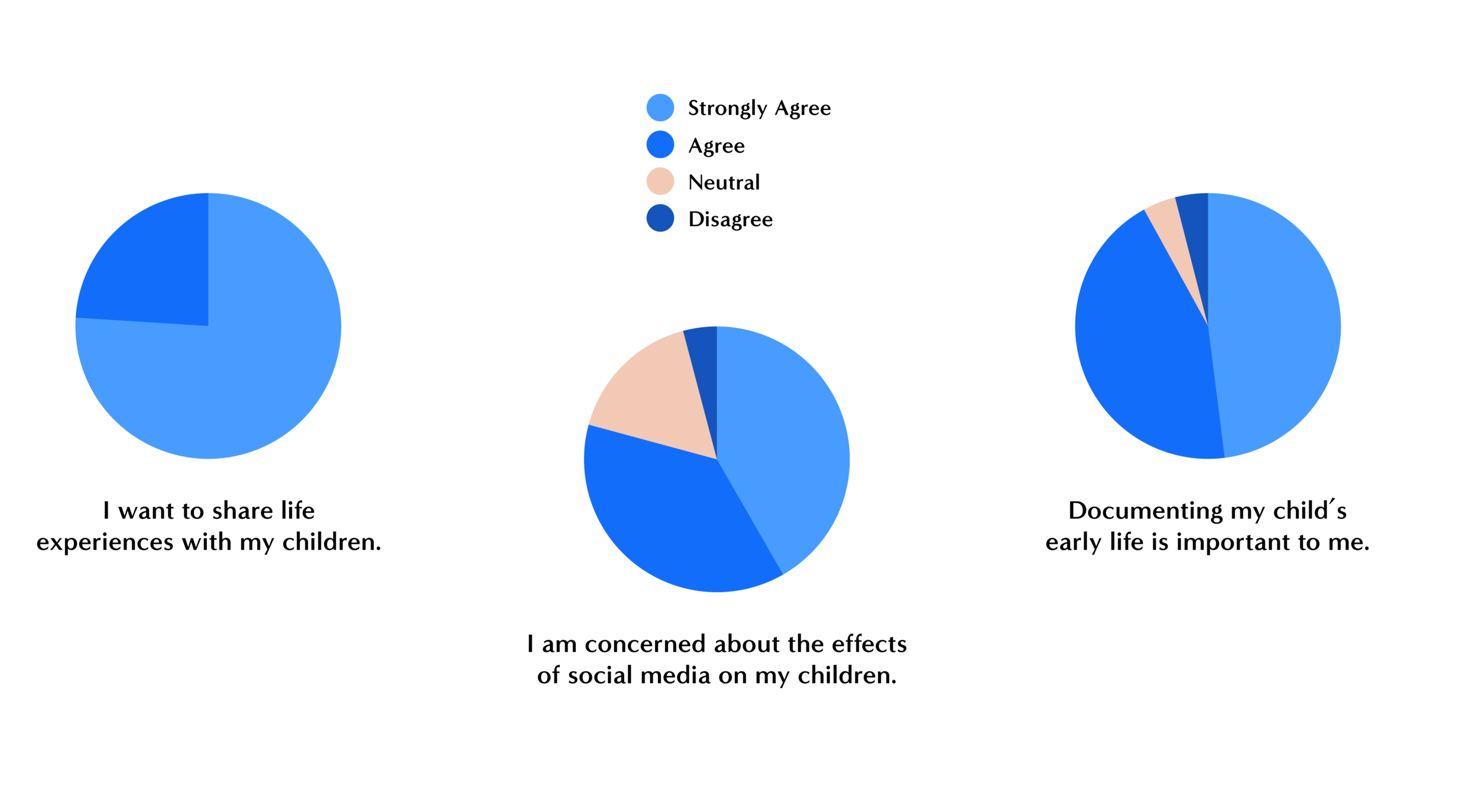
We performed 10 interviews of a range of different people, from grandparents to expecting mothers. Danny also provided us with a list of users of the Beta version of Lina who we reached out to via email with a survey. From the survey we learned:
Parents want to share their life experiences with their children
Parents are concerned about the effects of social media on their children
Documenting their child’s early life is important to them
Affinity Mapping
We synthesized our user interview research by creating virtual sticky notes on a Miro board and organizing them into “I” statements.
This helped us reveal key user insights such as:
I keep a journal/scrapbook/photo album
I have a good and communicative relationship with my children
I think there are negative aspects to kids using social media
I sometimes need a bigger screen than my phone
I think technology makes things easier
I use Facetime/phone/text to communicate with children who live away from home
Personas
Based on the findings from our affinity mapping, we created personas to represent our users. We ended up with two personas, Adam, who represents young parents who have to travel for work and have limited time with their children, and Helen, who represents the tech-savvy grandparent who lives far from her family.
Adam is constantly traveling for work and is worried he’s missing important moments in his daughter’s life. While he’s excited about a recent promotion, it also requires him to dedicate more hours to his career resulting in even less time with his family.
He and his wife want to create a digital baby-book for their daughter, where Adam can contribute insights learned from his travels and watch his daughter grow up back home.
Helen lives alone and her family is spread across the country. Though she sees them annually for St. Patrick’s Day and the holidays, she’s worried she’ll be unable to share her heritage and experiences with her grandchildren.
Unable to regularly see her grandchildren and conscious of her own age, Helen wants to digitally record her valued Irish traditions to pass down to them.
How might we help Adam and Helen share their lives, the lessons they’ve learned, and their cherished memories with their loved ones?
Proto-Journey Map
In order to visualize Adam or Helen’s journey through the app and understand how best to translate that experience onto a web platform, we created a proto-journey map which shows an aspirational path through the application.
Feature Prioritization
With Adam and Helen in mind, we began to brainstorm features that may help solve their problem. We used the MoSCoW method of prioritization because we were working within a very limited design period and had to focus on only the most vital features.

Sketching
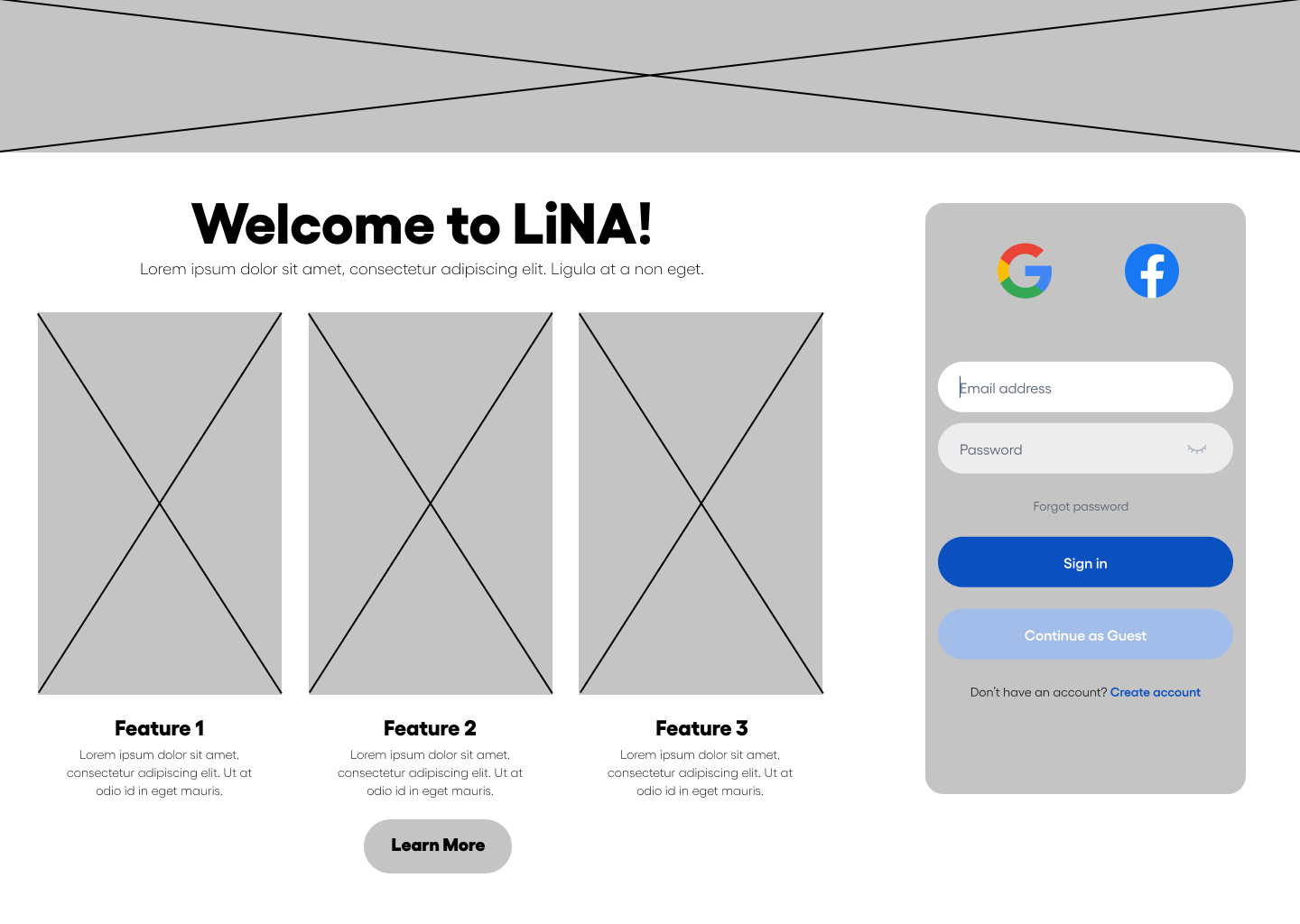
After deciding on the features that we wanted to focus our website around, we began sketching to get some ideas about how our website might look and how to fit in all the features we felt were most important. Because Lina already has a beautiful UI for their unreleased app, we tried to keep close to their established style so that when users switch between web and app, the shift would be as seamless as possible.


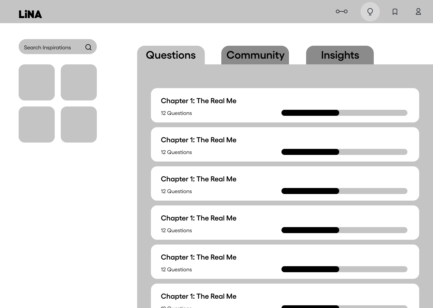
We ended up with many sketches and low fidelity wireframes that we turned into digital prototypes, which were then tested and iterated.
Usability Testing
We tested each of our medium fidelity digital prototypes four times, ending up with three iterations.
From our first iteration we learned:
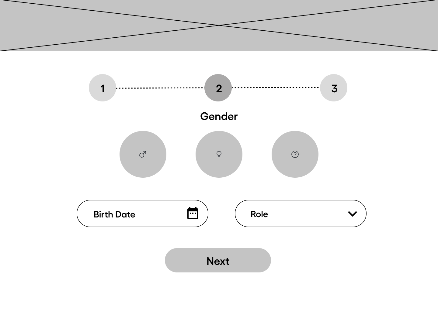
Some of the copy in the onboarding process was confusing and needed clarification
Users expected a back button on the onboarding pages
Users wanted more clarity on which page they were on
Overall the process of onboarding was clear
We made some of the changes suggested by the research and moved on to test our second iteration.
From our second iteration we learned:
Users wanted text on the gender selection buttons in onboarding
Users liked the ability to start as a guest but wanted the “finish making account” call to action to be more visible
Users enjoyed the ability to edit the secondary navigation to suit them personally
Users still felt that the onboarding process was clear and easy to navigate
Again, making changes based on user feedback, we addressed the main concerns and then put our final version in front of users before presenting it to our client.
In this last round of testing we confirmed that the flow of the site, from onboarding onward, worked well and was easy to understand for all demographics of people. We did receive feedback that indicated some text could be made bigger for additional readability which will be shared with the client as their art department takes our medium fidelity prototype and turns it into a high fidelity site.


Next Steps
Moving forward, our team will hand off our research and designs to Generation Transfer’s design team. They will build it out into a high fidelity website and release the finalized app and website at the same time. Generation Transfer will then use their advertising team and marketing resources to spread the word about Lina, hopefully becoming a huge success!
My team felt extremely lucky to get this opportunity to work as part of Generation Transfer and learn what it means to actually work for a client rather than creating a piece of work that made our teachers happy. For the first time in our ten week course, we had to create something that was going to make a real impact on the world, and be used by real people! I found this to be incredibly exciting and working with Danny, Lina’s creator, was a singularly uplifting experience. Danny’s passion for his vision helped our team stay upbeat and motivated, giving us a sense of purpose as we knew we were creating something that would truly help people form closer bonds with their loved ones. This project also taught me a lot about what it means to be on a team and what it takes to keep that team running smoothly.